How UI Tools Help Create Wallpaper-Ready Graphics
By Victor
Published June 26, 2025
 How UI Tools Help Create Wallpaper-Ready Graphics
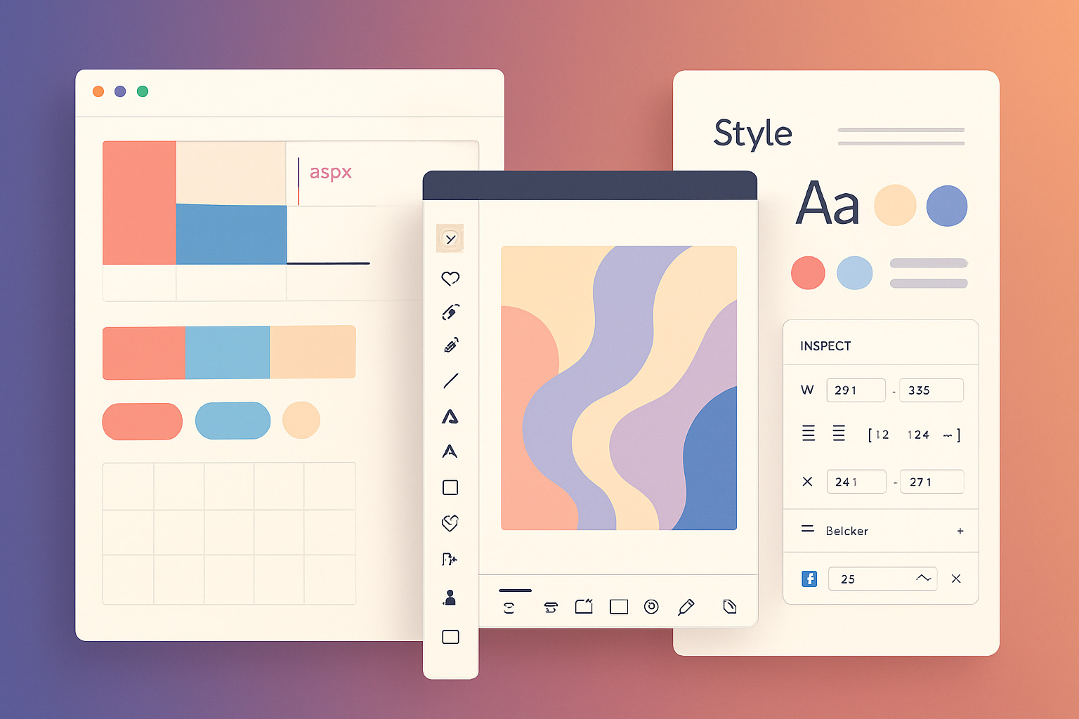
Designing wallpapers that resonate visually across devices is no longer about just placing a beautiful image in the center. With an increasing number of users seeking minimal, layered, or theme-based visuals, designers are drawing inspiration from UI tools to create cleaner, more functional wallpapers, sometimes even using them to convert image format for better compatibility.
These tools, originally built to streamline user interface design, now support workflows that benefit digital wallpaper creators just as much as app developers. Whether you’re building a calming mountain scene or a bold abstract layout, the principles and structure found in UI tools can directly shape the outcome.
Why UI Tools Matter for Wallpaper Creators
Modern wallpaper design isn’t isolated from process. Color theory, grid systems, visual hierarchy, and export logic all matter. UI tools provide:
- Precision: Grid overlays and alignment features keep balance consistent.
- Scalability: Vector-based design and responsive previews ensure clarity across screen sizes.
- Asset control: Layers, components, and symbols reduce duplication and maintain consistency.
These features are the backbone of most UI tools, but their real value emerges when adapted creatively for wallpaper design.
Key Features Wallpaper Designers Borrow from UI Tools
1. Artboard Systems for Multi-Device Layouts
Wallpaper creators often need to prepare graphics for phones, tablets, desktops, and ultrawide monitors. Instead of resizing manually, UI tools allow multiple artboards per project file—each optimized for a specific dimension. This encourages smart cropping and better spatial planning.
2. Color Styles for Palette Consistency
Creating multiple variations of a wallpaper? Lock in your primary, accent, and neutral shades using color styles. This makes it easier to develop cohesive packs (like monochrome or pastel collections) without repetitive manual adjustments.
3. Grid and Layout Systems
Symmetry, spacing, and visual flow are directly tied to layout grids. Whether you're designing minimal line-based wallpapers or complex geometric patterns, sticking to grid rules from UI design improves polish and usability.
4. Symbol Libraries for Reusable Elements
Repeating design components, like flowers in a floral pack or icons in a tech-themed set, benefit from symbols. Change one master instance and all duplicates update across your wallpapers. This keeps branding or illustration style consistent.
5. Typography Management
Text-based wallpapers need clean, readable type. UI tools treat typography as a system—type styles ensure you don’t accidentally mix weights, sizes, or spacing inconsistently across a wallpaper set.
How the Workflow Mirrors App Design
Digital wallpapers aren’t static assets. They now integrate with widgets, dark mode, and even live wallpapers. As such, the thinking behind their creation leans closer to product design than pure illustration.
A wallpaper collection might go through:
- Wireframe Mockups – Planning the composition before color.
- Componentization – Identifying repeatable pieces.
- User Context Testing – Previewing on different resolutions, even with icons and clock overlays.
- Export Rules – Ensuring 2x, 3x, and 4x resolution outputs are crisp without artifacting.
This process mimics UI development—and tools like Render.ly support this structure. Though often used for app handoffs, its asset export system is surprisingly helpful for wallpaper artists creating layered themes or collaborating with illustrators.
Cross-Influence: Coloring Pages and Wallpapers
Interestingly, some creators who build minimalist or line-art wallpapers also work on digital coloring pages. The overlap lies in structured layers and stroke control—skills that transfer directly from UI tooling into scalable graphics for both uses. A design initially made as a coloring sheet can morph into a textured, stylized wallpaper with color overlays and gradients.
Case Study: Category Application
Let’s say you're working on wallpapers in the Pastel Aesthetic or Minimalist Abstract category. Using UI tools, you can:
- Establish a modular color system that defines the soft shades in your pastel theme.
- Build repeatable triangle, circle, or hexagon patterns as scalable symbols.
- Set up dark and light variants using component overrides for dual-mode support.
The result? A streamlined workflow where one design variation births five complementary looks with no rework.
Exporting Without Compromise
UI tools often export assets in SVG, PNG, and PDF. Wallpapers require large resolutions (up to 8K for ultrawide monitors), and vector exports guarantee quality remains intact. You also maintain compression control—an overlooked factor that impacts download speed and visual clarity.
For creators offering free or paid downloads, this ensures every user gets a crisp, ready-to-use version—whether for iPhone lock screens or desktop backgrounds.
Bridging Function and Form
UI tools remind wallpaper designers that visuals need logic. Positioning, alignment, rhythm—these matter beyond aesthetic appeal. A well-balanced wallpaper respects the user interface: space for the time, icons, widgets, and more. No overlapping focal points. No accidental crowding.
Design is visual thinking. UI tools simply provide the blueprint. From color harmony to pixel perfection, they nudge creators toward higher standards—without confining creativity.
As design lines blur between software UI and visual art, wallpapers have become more than just background images. They're canvases of intent, crafted with the same care once reserved for buttons and nav bars. The tools are there. The mindset just needs to catch up.