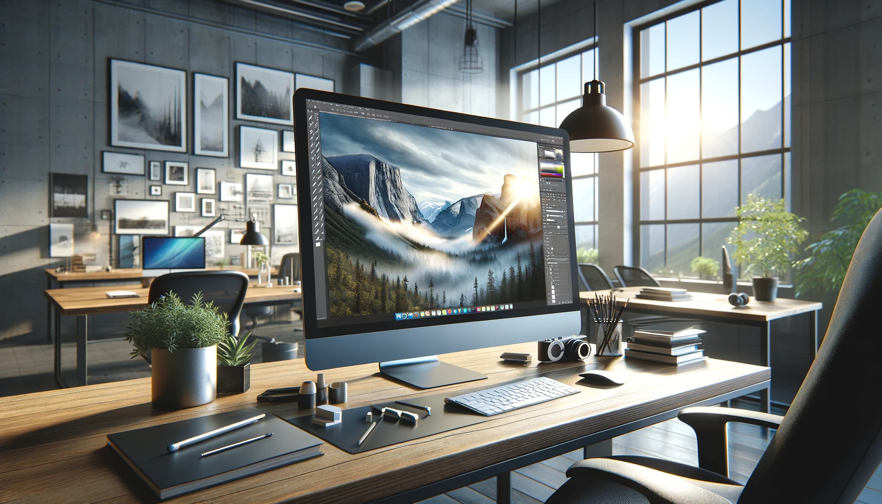
Responsive Web Design: A Guide to Using Upscaled Images
By Stefan
Published March 5, 2024
 Responsive Web Design: A Guide to Using Upscaled Images
In the ever-evolving landscape of web design, the use of upscaled images is a strategy that not only enhances the visual appeal of a website but also aligns with the principles of responsive web design. This article delves into the methodology behind upscaling images for web design, offering insights into optimizing these visuals for both aesthetic quality and website performance. By adhering to web design principles for image quality, developers and designers can ensure their sites offer an engaging user experience across all devices while also reaping the SEO benefits of high-quality images in web design.
This guide will walk you through the essentials of using upscaled images in your responsive web design projects, ensuring that your websites not only perform well but also look stunning on any device.
Understanding the Basics of Image Upscaling
Before diving into the specifics, it's essential to grasp what it means to upscale an image. Upscaling refers to the process of increasing the resolution of an image, making it larger without losing its quality. This is particularly relevant in web design, where images must adapt to various screen resolutions and sizes while maintaining clarity and detail.
The Importance of High-Quality Images in Web Design
High-quality images are not just about aesthetics; they play a crucial role in user engagement, retention, and conversion rates. They contribute to a site's SEO, helping it rank better in search engine results. The challenge lies in optimizing high-resolution images for faster loading, ensuring that these visual elements enhance the user experience rather than detract from it due to slow page load times.
How to Upscale Images: Best Practices
To effectively incorporate upscaled images into your responsive web design, follow these best practices:
1. Choose the Right Tools
Various software tools and online platforms offer image upscaling capabilities. Adobe Photoshop's "Preserve Details 2.0" feature, for example, uses advanced algorithms to upscale images with minimal loss of quality. AI-powered tools like Let's Enhance or Deep Image also provide excellent results by intelligently filling in details that traditional scaling methods might overlook.
2. Maintain Aspect Ratios
When upscaling images, it's crucial to maintain the original aspect ratio to prevent distortion. This ensures that the image looks natural and retains its intended composition across different devices.
3. Optimize for Web
After upscaling, optimize images for web use. This involves compressing the file size without significantly compromising image quality, ensuring that your website loads quickly on all devices. Tools like TinyPNG or ImageOptim can help significantly reduce file sizes while preserving the quality of your upscaled images.
4. Use Responsive Image Techniques
Responsive web design relies on techniques that allow images to adjust smoothly to various screen sizes. HTML's srcset attribute, for instance, lets you specify multiple image files for different screen resolutions, ensuring that the browser can choose the most appropriate version of an image to display.
5. Test Across Devices
Finally, test your images on various devices and screen resolutions to ensure that they look good everywhere. This step is crucial for identifying any issues with image scaling or quality across different viewing contexts.
Incorporating Upscaled Images into Your Workflow
Integrating upscaling images for web design into your workflow can significantly enhance the quality and responsiveness of your projects. Here's a step-by-step approach to doing so effectively:
- Assessment: Begin by assessing the current state of images on your website. Identify which images could benefit most from upscaling.
- Upscaling: Use your chosen tool to upscale images, following the best practices outlined above.
- Optimization: Optimize the upscaled images for web use, focusing on balancing quality and file size.
- Implementation: Implement these images using responsive design techniques, ensuring they adapt seamlessly to different screens.
- Testing: Conduct thorough testing across various devices and browsers to ensure optimal performance and appearance.
Conclusion
The use of upscaled images is a game-changer in responsive web design, allowing designers and developers to create websites that are not only functional across devices but also visually stunning. By following the best practices and incorporating upscaling into your web design workflow, you can significantly enhance the user experience, improve your site's SEO performance, and stay ahead in the digital landscape. Remember, in the world of web design, the quality of your visuals can make or break the user experience. Upscaling images is your ticket to ensuring that your visuals always hit the mark, no matter where or how they're viewed.