Responsive Web Design Multiple Devices PNG
A sleek responsive web design showcased across desktop laptop tablet and smartphone screens with blue and white interface elements.
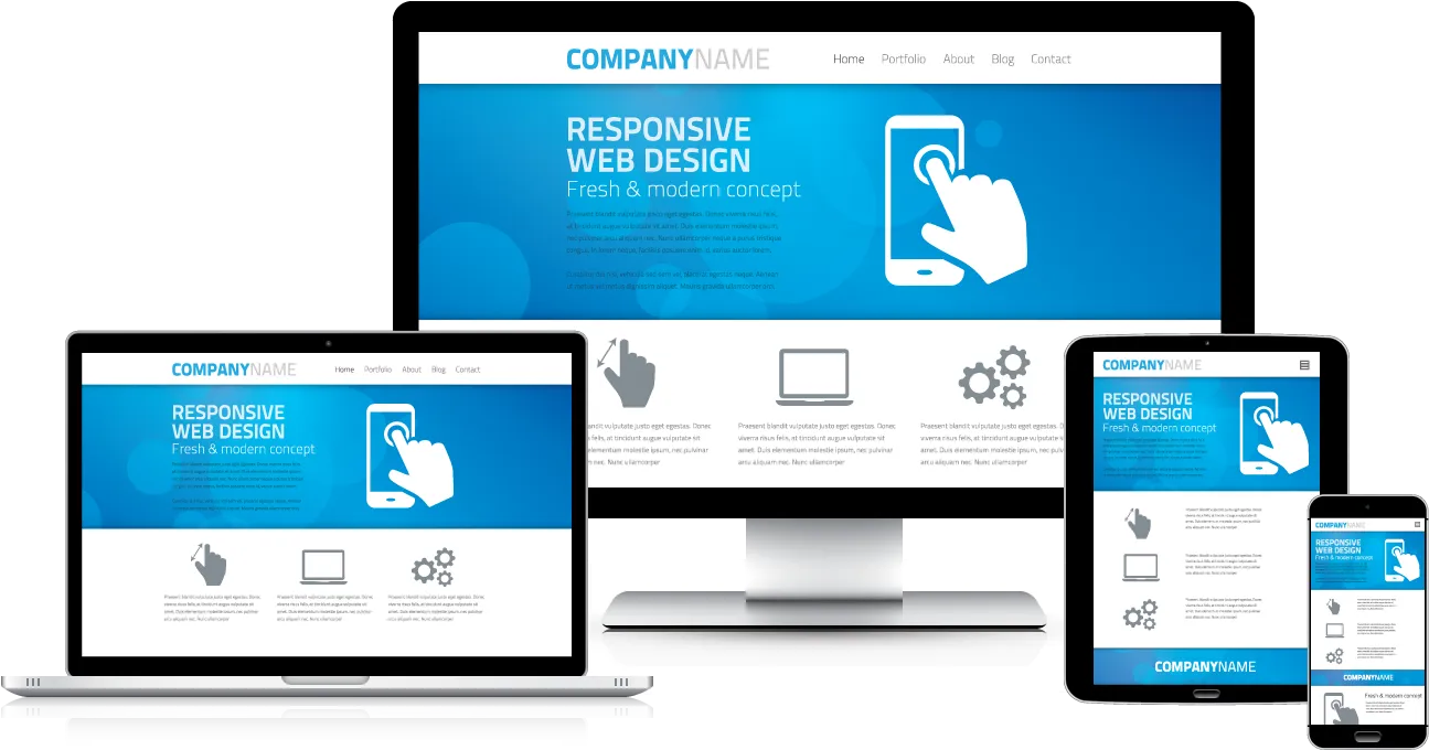
Image details 1295 × 680 · JPEG · Black
Size and format
- Resolution
- 1295 × 680 pixels (HD)
- Megapixels
- 0.88 MP
- Aspect ratio
- 16:9 · Landscape
- Best for
- Desktop and laptop screens
- File format
- JPEG
Colour
- Dominant colour
- Black
- Main colours
- Black, White, Blue
- Colour tone
- Cool
- Brightness
- Medium
- Contrast
- High
- Saturation
- Moderate
- Black and white
- No
- AMOLED friendly
- Yes · 34% true black
- Colour palette
- Black46%White29%Steel blue23%Taupe2%
Content
- Style
- Photo
- Subject
- Web design
- Mood
- Modern, clean, professional
- Time of day
- Daytime
Edit Responsive Web Design Multiple Devices PNG
Browse all PNG tools ›




Related Responsive Web Design Multiple Devices PNG
-

Web Development Concepts Board PNG -

World Mapwith Location Pins PNG -

Digital World Data Stream PNG -

World Mapwith Location Pins PNG -

Spider Web Silhouetteon Black Background -

News Banners Design Template PNG -

Wooden Pier Over Water Nighttime PNG -

Black Screen Texture Background -

Web Development Books Stacked PNG -

Spider Web Silhouetteon Black Background -

Wooden Bridge Over Black Backdrop PNG -

Wooden Pier Nighttime Perspective.jpg PNG -

Vintage Social Media Icons Stamp PNG -

Pointing Hand Icon Red Background -

Pointing Hand Icon PNG


Related PNG Categories
📌 Boards
Build your own collection of png
Boards are free personal collections of wallpapers, backgrounds, PNGs and SVGs. Keep them private or share with one click.