Responsive Web Design Multiple Devices PNG
A sleek modern website displayed across multiple devices from smartphone to desktop with a minimalist urban background.
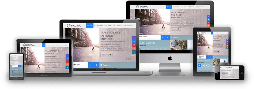
Image details 846 × 299 · JPEG · Black
Size and format
- Resolution
- 846 × 299 pixels
- Megapixels
- 0.25 MP
- Aspect ratio
- 21:9 · Landscape
- Best for
- Ultrawide monitors
- File format
- JPEG
Colour
- Dominant colour
- Black
- Main colours
- Black, Grey, White
- Colour tone
- Neutral
- Brightness
- Medium
- Contrast
- High
- Saturation
- Muted
- Black and white
- Yes
- AMOLED friendly
- Yes · 32% true black
- Colour palette
- Black55%Silver36%Dark grey9%
Content
- Style
- Photo
- Subject
- Website interface
- Mood
- Modern, clean, professional
- Time of day
- Daytime
Edit Responsive Web Design Multiple Devices PNG
Browse all PNG tools ›









Related Responsive Web Design Multiple Devices PNG
-

An Orchard Vineyard PNG -

Fernando Torres Paolo Rossi PNG -

Sharon Stone Smiling Wearing Black Mesh Net Top PNG -

Haikyuu Anime Shoyo Behind Net PNG -

Football Midfielder Gastón Brugman PNG -

Mosquito Net Covered Cot PNG -

Fishing Net Isolatedon White Background -

Pink Butterfly Net Illustration PNG -

Cartoon Fisherman Pulling Net PNG -

Telescopic Fishing Net Isolated PNG -

Fishing Net Heldin Hand PNG -

Fishing Netwith Handle PNG -

Black Grid Structure PNG -

Volleyball Net Close Up PNG -

Volleyball Net Illustration PNG -

Black Volleyball Net Icon PNG -

Volleyball Net Isolated PNG -

Curved Black Netting Texture PNG -

Branded Volleyball Net PNG -

Volleyball Netand Ball Clipart PNG -

Blueand White Volleyball Net PNG -

Volleyball Net Illustration PNG -

Black Metal Pull Up Bar Wall Mount PNG -

Volleyball Net Illustration PNG -

Marucci Sports Net PNG -

Fishing Net Isolatedon White Background -

Fishing Neton Transparent Background -

Fishing Netwith Handleand Clip PNG -

Solar Panel Portable Folding Unit PNG -

Triangular Fishing Neton Gray Background.png -

Cartoon Fish Caughtin Net PNG -

Fishing Net Foldable Design PNG -

3 D Animated Character With Net PNG -

Rolledand Unrolled Window Screen Mesh PNG -

Banana Peel Trashcanand Volleyball Net PNG -

Ross Garden Netting Packaging PNG


Related PNG Categories
📌 Boards
Build your own collection of png
Boards are free personal collections of wallpapers, backgrounds, PNGs and SVGs. Keep them private or share with one click.
Get this on your phone
Scan with your phone camera to open this page.